Offset
An Information Oracle for Climate-Conscious Consumers. A mobile app helping New Yorkers make informed, quick shopping decisions through instant product scanning and community resources.
Offset is a barcode-scanner app that empowers urban shoppers to make confident, climate-positive purchases by translating complex sustainability data into clear, actionable insights.
Research revealed that consumers experience decision fatigue and cognitive overload due to fragmented information, greenwashing, and higher perceived costs associated with sustainable products. Offset addresses this by consolidating sustainability metrics into a single, easy-to-understand interface—offering real-time carbon insights, price comparisons, personal impact scores, and a reward system that incentivizes conscious shopping.
Role
UX Researcher
Product Designer
Timeline
15 Weeks
Team
Solo Project
Tools
Figma, Miro, Adobe CC
Key Deliverables
Research, Wireframes, Prototype
Metrics
100%
of participants described the interface as “clear” or “intuitive.”
90%
preferred scanning over manual sustainability research.
60%
increase in decision confidence after using the prototype.
The Climate Crisis in Your Shopping Cart
72%
of greenhouse gas emissions directly associated with household consumption.
1.3B
tons of solid waste is generated annually, which is expected to reach 2.2B by 2025
The Problem
Climate change feels overwhelming and confusing for consumers trying to make eco-friendly purchases.
Despite growing environmental consciousness, consumers usually face significant barriers when attempting to shop sustainably, including misinformation that makes it difficult to identify genuinely sustainable products, information overload, cost perception barriers, and lack of awareness about local community resources.
Key Challenges
Cost Perception Barriers
Sustainable living is framed as expensive and exclusive
Lack of Local Resources
Limited awareness of community support and alternatives
Greenwashing & Misinformation
Identifying truly sustainable products is challenging
Information
Overload
Conflicting claims overwhelm users with decision paralysis
“Sustainability is becoming a buzzword, and people care about it. There’s so much misinformation, especially with the consumer. I think our consumer loves to have immediacy, and they don’t necessarily look into the bigger picture of what things mean.”
Research Methodology
I employed a comprehensive mixed-methods research approach to deeply understand user needs, behaviors, and pain points around sustainable shopping.
The research strategy encompassed both qualitative and quantitative methodologies to ensure robust data collection and validation.
-
In-depth understanding of shopping habits and sustainable living practices. 6 Semi-structured interviews across three user archetypes.
Participant Breakdown:
2 Veterans: Highly sustainable, experienced users
2 Aspirers: Moderately sustainable, motivated to improve
2 Novices: Slightly sustainable, just starting their journey
-
3 diary studies tracking daily sustainable choices and practices over multiple weeks to identify behavioral patterns.
Participant Breakdown:1 Veterans: Highly sustainable, experienced users
1 Aspirers: Moderately sustainable, motivated to improve
1 Novices: Slightly sustainable, just starting their journey
-
Market landscape assessment and feature gap analysis using the existing apps.
Analysis Scope:Direct competitors: HowGood, JouleBug, OneSave/Day, Cogo
There's a clear gap in mobile-first, user-centric solutions that make sustainability transparent and engaging for everyday shoppers.
Elements like progress tracking, points, and habit reinforcement could be adapted for shopping-related sustainable actions.
-
Location: A Sustainable Village (East Village)
Key Activities:
Zero-waste store visits
SME interview with founder Jaclyn Roster
Real-time observation of shopping behaviors
Key Insights:
Shoppers mostly came for refills and seemed familiar with the store as they made informed choices.
Most looked like regulars; not one patron in the entire 45 minutes seemed like a first-time visitor.
Key Findings:
Veterans and Aspirers: Most shoppers were well-informed and knew what they were looking for.
Personal use items: Reusable pads, travel mugs, and haircare products were popular purchases
Regular customers dominated: few first-time visitors observed
-
Analogous systems: FDA nutrition labeling, habit-building apps
Carbon Labels:
Similar to a nutritional label, a carbon label helps consumers understand the impact of the item they are purchasing or consuming. The carbon footprint of the item is calculated by a consultant that is familiar with product carbon footprint quantification standards.
Affinity Mapping
Four critical themes emerged from our research synthesis
Key Insights
1. Cost & Affordability
Users perceive sustainable products as expensive despite potential long-term savings. Cost and Convenience Barriers are a huge deciding factor.
"It's a trade-off between price and convenience, which are the two key drivers of human interaction or exchange.” - Ryan
2. Information Overload
Misinformation and complexity lead to decision paralysis. The need for immediacy creates a barrier, compounded by challenges in accessing and verifying accurate information.
"Sometimes it's interesting also to think about like the footprint... Where was it being shipped from?” - Rebecca
3. Habit Formation
Long-term sustainability requires building habits, but users struggle with burnout. Forming long-term habits is challenging.
"I think it may start to feel like a burden at some point...feeling like an added responsibility ”
- Danielle
4. Comfort Zones
Users default to familiar shopping patterns, requiring gentle nudges. Leaving comfort zones is difficult creating behavioral change barriers.
"Internal factors like laziness definitely stop me from being 100% conscious everyday.”
- Vindhya
How Might We Framework
Based on research insights, I developed strategic design challenges
Simplify the research and identification of sustainable products so users feel confident in their purchase decisions?
1
Support users to find affordable, manageable green practices they can maintain in their daily routines?
2
Assist users in building a green local community and bringing relevant resources to their phone screens?
3
Encourage long-term lifestyle shifts and invoke environmental consciousness?
4
User Personas
-

Sarah Johnson
NOVICE
Age: 26, Graduate Student
Motivation: Beginning sustainability journey, needs approachable entry points
Pain Points: Feels intimidated by sustainability complexity
Goals: Build sustainable habits gradually without overwhelming lifestyle changes
-

Marcus Rodriguez
VETERAN
Age: 32, Environmental ConsultantMotivation: Deeply committed to sustainability, seeks to optimize impact
Pain Points: Limited time for research, wants granular data
Goals: Maximize environmental impact efficiency
-

Amy Chen
ASPIRER
Age: 28, Marketing Coordinator
Motivation: Wants to live more sustainably but needs guidance and verification
Pain Points: Overwhelmed by conflicting information, price-conscious
Goals: Make confident sustainable choices without extensive research
Typical User Journey
1.Awareness
Sees Offset via social media or word of mouth. User realizes they want to make more sustainable choices
Motivated
Curious
2. Research
Downloads app, tries scanning a product at the store. Seeking information about sustainable products
Overwhelmed
Confused
3. Decision
Experiences instant, actionable insight and signs up. Choosing between green and conventional options
Uncertain
Cautious
4. Action
Making the purchase and trying sustainable alternatives. Uses scanner and tracks progress
Hopeful
Tentative
5.Reflection
Evaluating the experience and impact of choices
Shares impact and recommends Offset to friends
Satisfied
Disappointed
User Journey Mapping
Amy Chen an Aspirer
The emotional journey map revealed critical touchpoints where users experience peaks (instant feedback post-scan) and valleys (products lacking ratings), directly informing feature prioritization and database development strategy.
Design Process
1. Research & Discovery
User interviews, competitive analysis, and problem definition
4. Mid-fidelity Refinement
Interactive prototypes with user feedback integrationUsed
2. Ideation & Concepts
Brainstorming sessions and validating concepts with users through rapid sketching
5. High-fidelity Design
Visual design, branding, and detailed interactions
3. Low-fidelity Prototyping
Paper sketches and initial wireframes to test core flows
6. Testing & Iteration
Usability testing and final refinements based on feedback
Lo-Fi Design Sprint & Testing
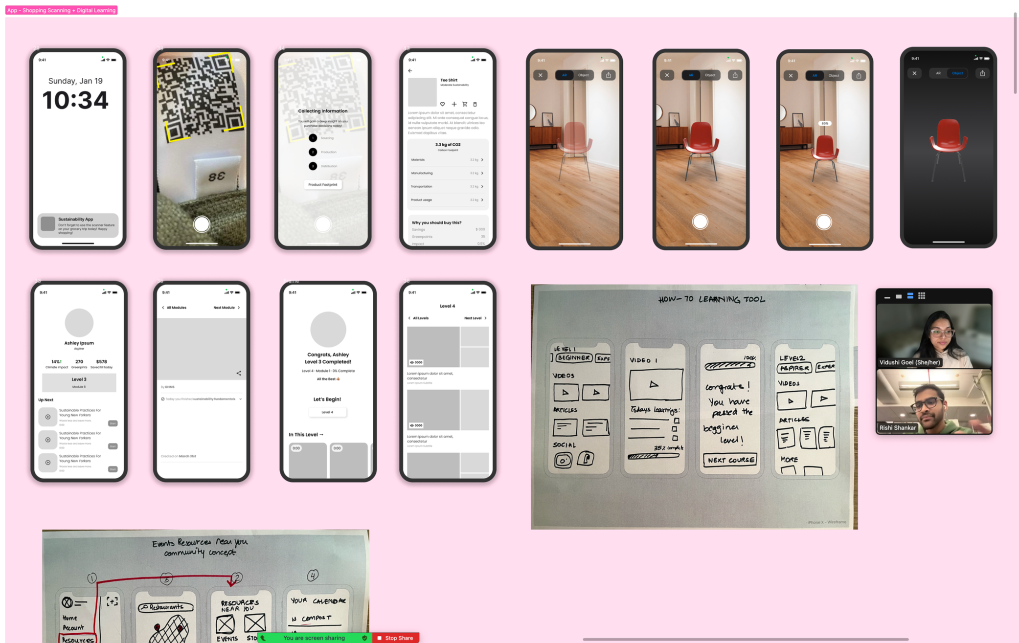
Crazy-8 Sketching
Explored six concepts: scanner, video learning, community map, habit tracker, AR, and marketplace.
Low-Fidelity Testing
Rapid sketched and tested with 11 informal users; users valued scanner, community, and gamification.
11 users tested
95% loved the scanner
85% engaged with learning
80% valued community map
User Feedback
Mid-Fi Prototyping
-
![]()
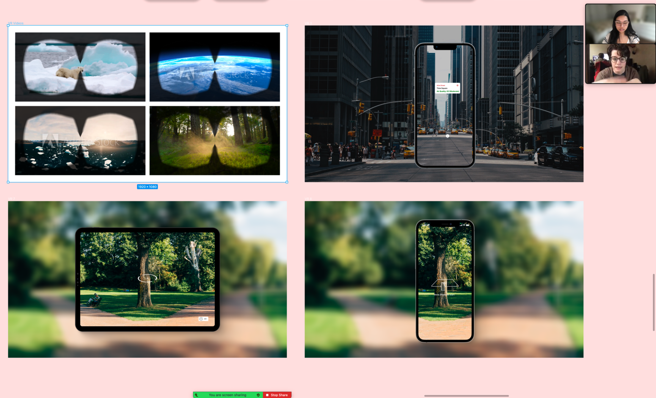
Virtual Reality
75% Validation
Video-based education and VR climate experiences -
![]()
Scanner
95% Validation
Scan barcodes for instant sustainability info -
![]()
Community
80% Validation
Map of local sustainable businesses and events

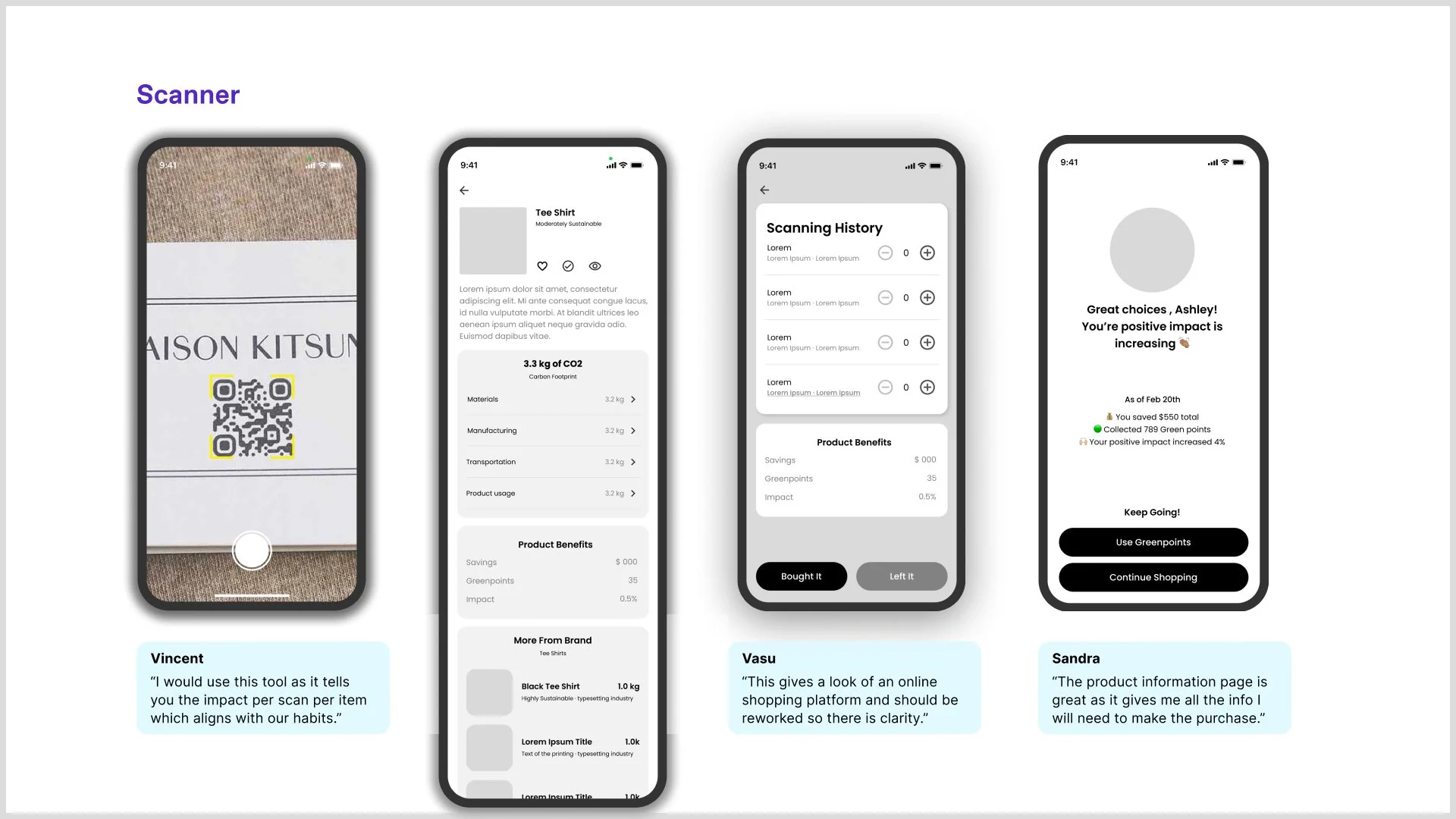

User Feedback
-
"I would use the scanner as it tells you the impact per scan per item which aligns with our lifestyle and habits."
Vincent
-
"The product information page is great post scanning and gives all the information I look for before making a sustainable purchase."
Sandra
-
"I think VR is very cool and all of us are moving that way. I'd love to see some gaming interaction for greenpoints in VR too as it will add incentive."
Sandra
A/B Testing
Two divergent flows were tested; the scanner + community + learning flow achieved 94% task success.
Tested with 6 users; scanner was most useful, AR less valuable than community, VR was engaging but needed actionability.
Feature Prioritization - MoSCoW Framework
Must Have
Product Scanner – Instant sustainability ratings
Impact Dashboard – Personal savings & CO₂ offset
Product Comparison – Side-by-side analysis
Should Have
Learning Hub – Video education & VR
Community Map – Local sustainable resources
Habit Tracker – Gamified challenges
Solution Highlights
Core Features
Instant product scanning for sustainability data
Personalized impact tracking & savings
Compare sustainability ratings, price, and impact between products.
Gamified habit building with GreenPoints
Design Principles
Immediate clarity
Progress celebration
Community connection
Trust through transparency
IA & System Map
A comprehensive site map and system diagram ensured intuitive navigation and seamless data flow:
Homepage
Scan, search, or browse products.Product Details
Sustainability ratings, impact metrics, and comparisons.Dashboard
Tracks savings, GreenPoints, and personal impact.
Visual Identity & Branding
To make sustainability feel exciting and reduce user hesitation around learning, I adopted a neobrutalist design approach—using bold layouts, vibrant colors, and playful illustrations to convey an environmentally conscious and engaging personality.
Typography
Space Grotesk for headlines
Diatype family for body text (Dinamo Typeface)Color Palette
Sustainable green spectrum
(#22C55E, #16A34A, #15803D, #166534)Visual Principles
Clean hierarchy, bold contrast, approachable interactions, clear information architecture
offset
verb
a: to place over against something :BALANCE
b: to serve as a counterbalance for :COMPENSATE


Hi-Fi Prototype
Hi-Fi Testing
3 users tested a flow of 30+ screens; praised UI, wanted clearer affordances and less text-heavy design
UI
Clean, approachable, and easy to navigate. Focused on reducing cognitive load and highlighting key information
Success
Users found the app pleasant, well-balanced, and fun to use.
“The testers and industry experts overwhelmingly praised and embraced the overall branding, finding it both appealing and enjoyable.”

App Features and Prototype
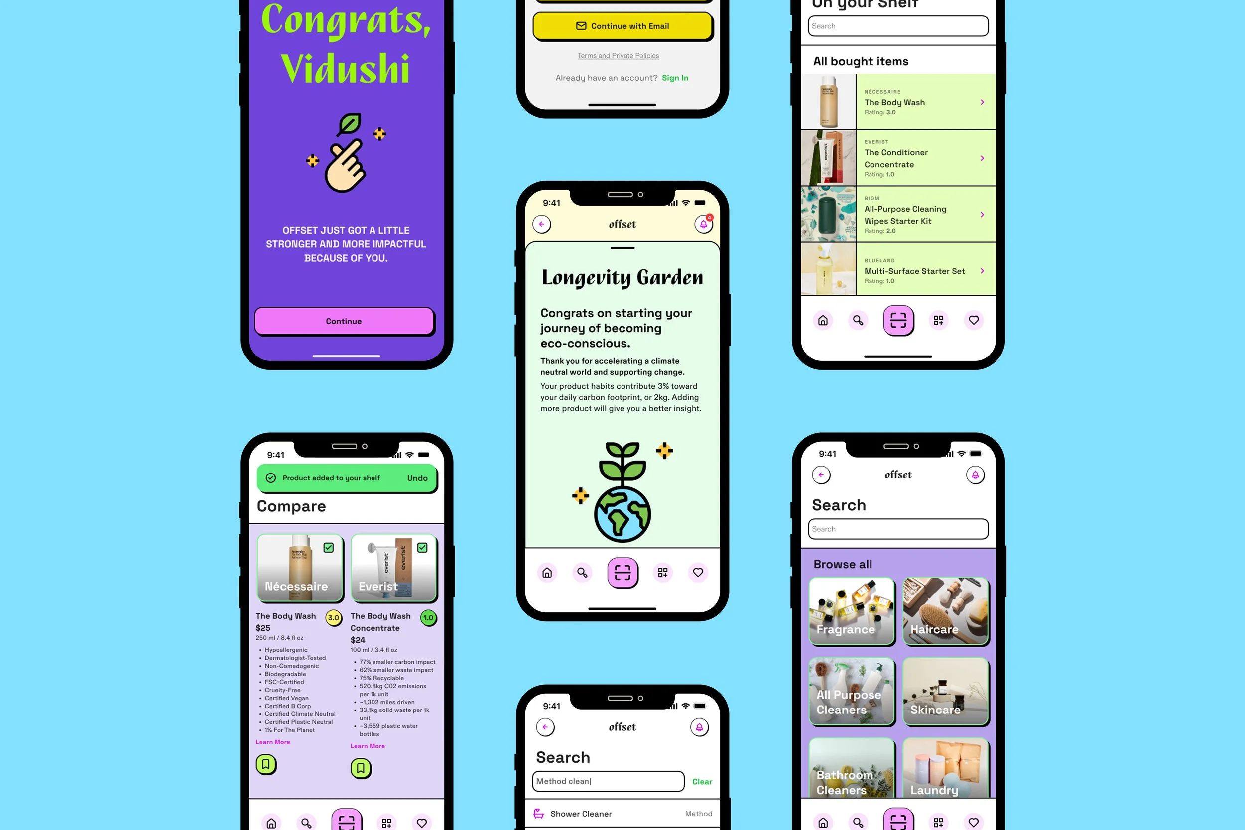
Onboarding + Sign-Up
The onboarding flow uses progressive disclosure to introduce core features—scan, browse, and search—without overwhelming new users. Designed with Hick’s Law in mind, each screen limits choices to maintain clarity and ease of decision-making.
Sign-up enables personalization, unlocking features like saved lists, activity tracking, and environmental impact insights. The process emphasizes Recognition over Recall, making navigation intuitive and fostering early user confidence and retention.
First Scan
📷 Scanner
Enables just-in-time information through barcode scanning. Displays product data—manufacturing, certifications, and footprint—in a standardized UI pattern for quick comprehension and decision support in-store.
🔍 Post-Scan Product Analysis
Presents complex sustainability data in a clear, visual format using progressive disclosure and plain language.
Reduces reliance on jargon by prioritizing Recognition over Recall, making information learnable, accessible, and non-intimidating.
Helps users build understanding and make informed choices with high visibility and low cognitive load.
⭐ Rating System
Applies a recognizable scoring model (1–10 scale) to communicate sustainability. Based on objective criteria like certifications, packaging, and production lifecycle—supports trust and transparent choice architecture.
Longevity Garden
📊 Dashboard
Applies information hierarchy and visual feedback to display a user’s overall impact—combining Eco Points, Offset Points, Carbon Emissions, and Monetary Savings. Offers a clear, motivating snapshot of progress.
⚖️ Create Balance
Encourages user agency by allowing contribution of Offset Points to verified climate initiatives. Designed using goal-gradient effect to inspire continued action.
🌿 Longevity Garden
A visual, emotionally resonant delighter that grows as users engage with the app.
Reflects long-term eco-conscious habits using progressive disclosure and ambient feedback, fostering pride and continued engagement.
🤖 Personalized Recommendations
Leverages user data (Shelved, Wishlisted, and Browsed items) to offer contextual suggestions.
Drives relevance and discoverability with an AI-powered recommendation engine, supporting both convenience and climate-conscious behavior.
Wishlist & Shelve
📦 Shelve
Acts as a digital “sustainability shelf” where users store purchased products.
Tracks Offset Points and climate impact over time, adding a layer of progress tracking and reinforcing the app’s gamified feedback loop.
📝 Wishlist
Supports goal-setting behavior by allowing users to save products they aspire to buy.
Encourages future planning and reinforces habit formation in sustainable shopping choices.
Compare
⚖️ Product Comparison
Enables side-by-side evaluation of products using clear, standardized sustainability metrics.
Applies visual hierarchy and recognition over recall to simplify complex data, helping users quickly identify the most eco-friendly option with minimal effort.
Reflections & Learnings
Iterative testing reduced risk and refined feature clarity, ensuring design decisions were validated through real user feedback rather than assumptions.
Simplifying complex sustainability data was critical to building trust, translating emissions metrics and certifications into clear, actionable insights.
Balancing user needs, climate impact, and business feasibility strengthened the product strategy, especially when resolving conflicting feedback.
Community-driven and inclusive research improved accessibility and long-term engagement, reinforcing transparency as a core UX principle.
Future roadmap focuses on scale and personalization, including real-time carbon tracking, AI-driven recommendations, retail partnerships, and expansion beyond NYC.