The Reserve Bank Of India
How I helped transform a financial giant’s clunky, outdated digital presence into a sleek, user-friendly powerhouse for millions of users across India.
Redesigning the central bank’s website and app to enhance usability, accessibility, and engagement for millions of users.
The Reserve Bank of India (RBI) is the nation’s apex financial institution, providing critical financial information, policies, and services to a diverse audience, including the general public, researchers, and financial professionals. Despite its authoritative role, RBI’s digital presence was outdated, difficult to navigate, and lacked accessibility.
Role
Co-lead Designer and User Researcher
Timeline
30 weeks (2022-2023)
Team
PwC India (50+ collaborators)
Tools
Adobe XD and Illustrator
Shipped Deliverables ✅ 🚀
Research, Wireframes, Prototype
Impa 📊
NPS
From 2 to 80
CSAT
8.8/10
TCR
Increased to 95%
100%
WCAG AA compliance
100%
Likability Score
UX Research Leadership
Independently led end-to-end UX research, including recruitment, interview guide creation, and conducting 6 in-depth user interviews.
Synthesized insights into actionable recommendations through heuristic evaluations and usability testing.
Translated research findings into clear strategic direction for product and design decisions.
What I did
Leadership & Collaboration
Managed and directed a 10-member design team across wireframes, visual design, and quality control.
Led client presentations and strategic recommendations.
Collaborated closely with developers, strategists, and project managers to align research insights with technical feasibility and delivery timelines, while ensuring continuity through ongoing knowledge transfer.
Design Strategy & Systems
Co-Led the UX redesign of a large-scale public financial ecosystem spanning 60+ unique websites.
Designed a scalable design system, lean branding framework, and restructured the information architecture to improve clarity, accessibility, and consistency.
Oversaw A/B and multivariate testing to validate design performance.
RBI is the country’s financial nerve center regulating banks, setting policies, and basically deciding the fate of the rupee.
You’d think their website would match that level of importance, right?
Well... not quite. RBI retained decades old design of their website and had great heuristic and usability issues.
Redesign RBI’s website and mobile app into an intuitive, modern, and inclusive digital experience—without losing the gravitas of India’s apex financial institution.
The Problem
Low user engagement
The website had a poor Net Promoter Score (NPS) of 2, indicating dissatisfaction.
Key Issues
Discoverability issues
Users struggled to find crucial financial updates, circulars, and policies.
Accessibility & Responsiveness
The website was not designed for diverse user needs, leading to poor usability scores.
Outdated branding & User Interface
The visual identity did not reflect RBI’s credibility or modern financial advancements.
Stakeholder immersions and design facilitation
We got together with the client and rallied key stakeholders to nail down project goals and pin down client needs—setting killer metrics and raising the bar with industry standards.
This helped kickstart the white-boarding sessions with the team, resource allocation, and design research.
Diving Into the Mess—User Research & Pain Points
If you think central banks don’t have users, think again. RBI’s audience was massive and diverse, including:
Regulated entities
The Followers.
(private banks, forex traders, financial institutions)
Business owners & policymakers
The Guidance Seekers.
(who relied on RBI guidelines)
Everyday information seekers
The Information Seekers.
(students, job applicants)
Researchers & economists
The Super Users.
(who needed data, fast)
Mix-Method User Research
-
User Interviews
We conducted 30+ stakeholder interviews (45-60 minutes each) to uncover real pain points through targeted use cases and tasks. Check out our detailed end-user interview guide below.

-
Survey
We surveyed over 200 users to uncover key pain points, behavior patterns, and insights. Our findings revealed a glaring usability issue: only 12% of respondents could successfully access the mobile app, highlighting a critical gap that needed addressing.

-
Competitive Benchmarking
We combed through global central banks and top financial platforms to extract killer UX practices. By scrutinizing SEO, traffic performance, usability, and content structures, we armed ourselves with insights to supercharge RBI’s redesign.

Users’ Pain Points
“The updates on the notifications tab are neither categorized, nor is there a filter. Becomes difficult to find what I really need”
“It feels like they haven’t really paid attention to the look and feel at all. The makers have focus more on making sure all the information is available in detail”
“I have to remember when the Notification came out. They have a timeline here. But I need to remember, so I might as well go to Google”
“The homepage is very old fashioned... everyone is revamping their homepage and so should RBI.. The page and colour combination looks really boring”
After 200+ surveys and 30+ interviews,
a pattern emerged:
🔎
The problem wasn’t the information itself—it was finding it.
Users saw RBI as a credible authority, but content discoverability was a major pain point. People knew RBI was a trustworthy source, but the website felt like a maze of PDFs, dense text, and broken search functions.
The app? Barely used because it wasn’t optimized for mobile and lacked engaging features.
💡
Key Insights
Users wanted structured, intuitive navigation and search—not an endless dump of documents and redundant page.
The mobile experience needed a massive upgrade.
RBI’s brand identity felt outdated and didn’t reflect its status as a financial leader.
A Lack of synch between potential and delivery.
The website was seen as a passive information repository where users engage only on a transactional basis—visiting only when necessary.
Opportunity
Accessible Expansiveness
To be seen as a helpful and active partner in the users search for knowledge. An experience that celebrates thevastness of wisdom that RBI has to offer to its users, without being intimidating. One that is:
Inviting
Intuitive
User-friendly
Actively Engaging
An interface that gradually opens its folds, not only enabling users to find what they need, but also inviting them to immerse and explore.
The Fix—Strategizing a Seamless Experience
IA: Making sense of 60+ websites
First things first: we tackled the information mess.
Streamlined 60+ web pages into a structured, user-friendly IA based on Jobs to Be Done (JTBD) principles.
Introduced personalized dashboards and automated alerts for critical financial updates.
Designed an accessible, multi-language navigation system optimized for both desktop and mobile.
Established a convention for primary (tri-fold) and secondary navigation.
UX & UI Design:
Balancing Trust & Modernity
The Design Process
Research and Discovery:
- Conducted industry audits to identify usability flaws and establish best practices and recommendations.
- Analyzed over 500 screens using heuristic evaluations, compiling a comprehensive master of unique pages, and components for the design system library.Iterations and Conceptualizing:
Created rapid sketches and wireframes to test various navigation models, content design and feasibility.
User Testing & Feedback
Method: Multivariate Testing
Ran multivariate testing on different design directions, and guess what?
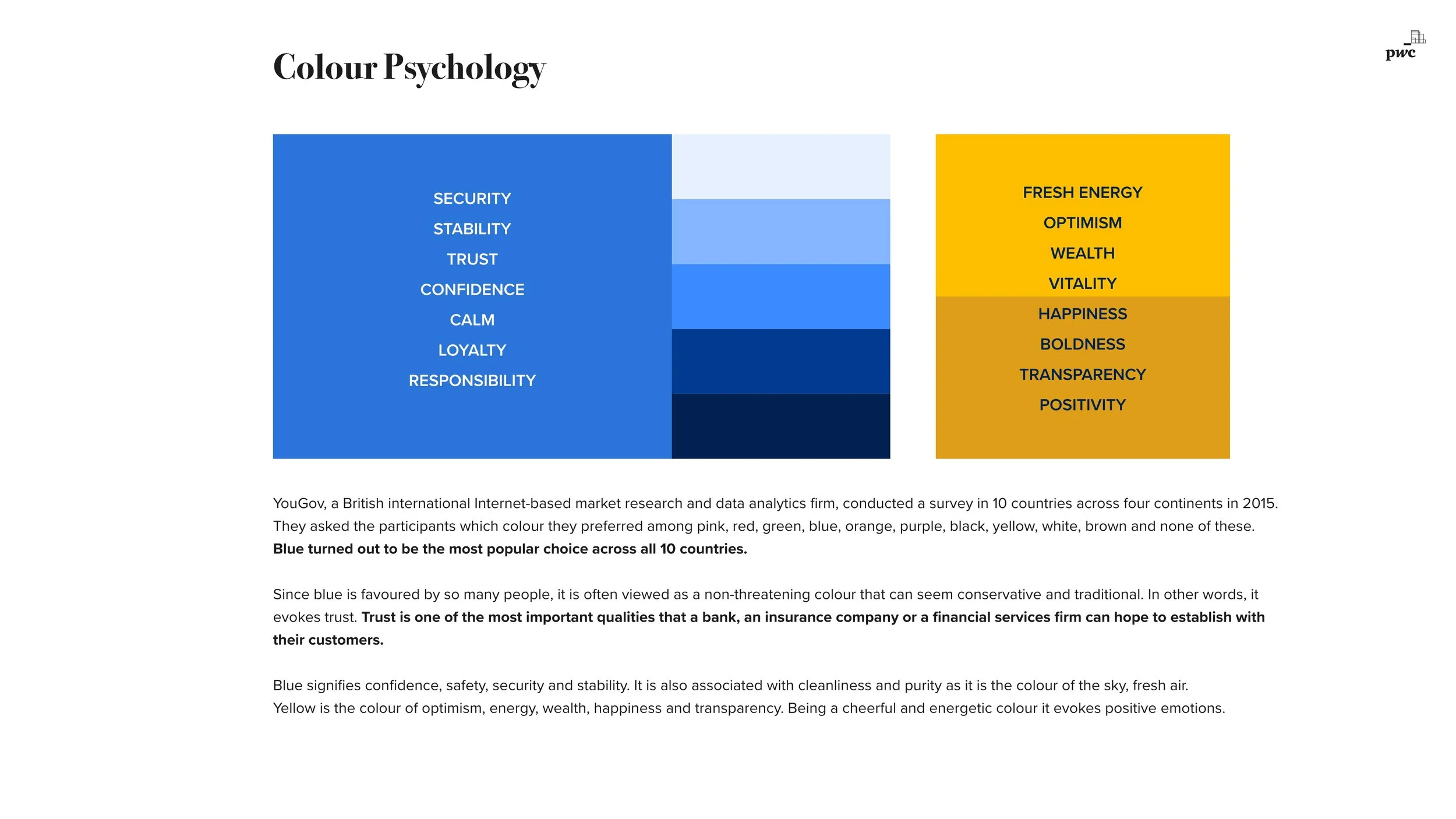
Users rejected lavender (seen as too colonial & royal) even though the client loved it.
Blue won—a color deeply associated with trust, stability, and authority in financial institutions.
UI Evaluation for visual identity
Method: A/B testing
Two Bold Systems, One Champion.
Users preferred blue over lavender, associating it with trust and stability.
Design System and Lean Branding
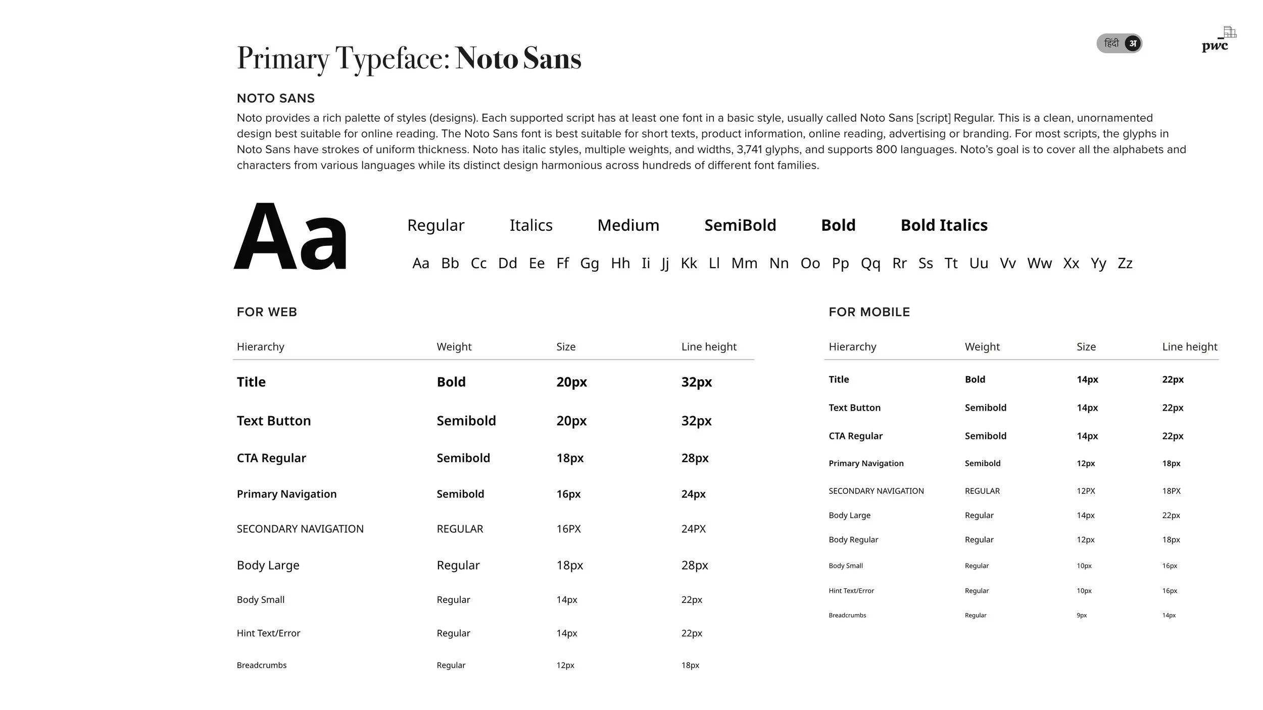
We created a custom design system with:
Accessibility WCAG compliant visual design
Scalable component library
Color psychology -friendly colors (4.5:1 contrast ratio)
Dark and Light themes
Multi-language support
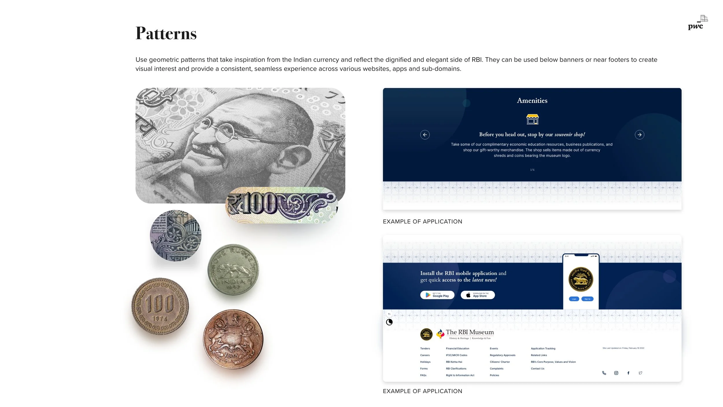
Custom illustrations & icons inspired by Indian currency and new banknotes
Conducted multiple usability tests with end users, refining the user interface: navigation, readability, and content hierarchy.
Integrated client feedback loops to fine-tune the final design and continually incorporate changes.


Light Mode Component Library
Dark Mode Component Library
WCAG Color Accessibility
Hi-fi Prototyping
A seamless responsive experience across devices. Scan QR for the experience.
See the Design in Action
RBI’s digital presence went from clunky and intimidating to modern, accessible, and user-friendly—a transformation that proved good UX can humanize even the most complex institutions.
Mobile-First Thinking: Fixing the App
Despite discovering that mobile wasn’t users' top choice, the apex financial institution still required a full digital transformation. The app brought one of the world's largest economies front and center, providing an inclusive, accessible, and robust digital presence to meet the needs of diverse users.
Compatible with on mobile, desktop, tablets and web.
See the mobile app and desktop app experience below.
Advanced Search
Recognizing that discoverability, notifications, personalization, and overall information visibility were major pain points, we designed a predictable, global search functionality that spans RBI’s entire digital ecosystem.
This intuitive search experience empowers users to quickly locate critical data, seamlessly enhancing information dissemination and elevating the overall user experience reducing cognitive load and effort.
The Homepage
RBI’s new homepage is a dynamic, interactive hub that brings India’s financial world to life. With a smart, multi-tiered data hierarchy and engaging information visualization, users can effortlessly access key updates, detailed reports, and financial data.
Captivating interactive elements elevate visual engagement and transform complex information into an accessible, enjoyable experience—all on a mobile-friendly platform designed for millions.
Usability Testing:
Did It Work?
We tested interactive mid-fi prototypes with real users, iterating based on feedback.
Users completed tasks 95% faster than before.
Satisfaction scores skyrocketed.
Developers loved the clean, structured handoff (less back-and-forth = happy devs).
The Results—Turning Numbers Into Impact
NPS improved from 2 → 80
indicating a significant boost in user satisfaction.
Improved SEO & discoverability
reducing bounce rates and increasing return visits.
Enhanced mobile usability,
leading to higher engagement.
Customer Satisfaction Score (CSAT)hit 8.8/10
Task Completion Rate (TCR) increased to 95%
Reflections & Learnings
This project reinforced my commitment to designing accessible, large-scale digital systems that deliver measurable impact under complex constraints.
Large public-sector initiatives demand patience, diplomacy, and structured coordination across designers, developers, and government stakeholders.
Complex financial institutions can deliver intuitive, engaging experiences without compromising credibility or trust.
Strong UX leadership requires balancing product vision with technical feasibility from the outset.
Scaling a unified design system across 60+ digital properties requires rigorous documentation, governance, and testing discipline.
Managing a rotating team in a high-pressure environment strengthened my ability to lead knowledge transfer, onboarding, and quality control while maintaining delivery standards.


